


TKM Gallery, a set on Flickr.
Friday, January 18, 2013
Thursday, October 11, 2012
My last Blog encouraged you to
make those darn empty Pot Shelves more interesting! Now, I will show you how
easy it is to do! Before you start...I have a couple of helpful hints:
1) You will need a good ladder, small head nails and a hammer.
2) Keep in mind that you will want everything you place way up
high on your pot shelf to be seen from ground level...so, I use
"stuff" to act as a base to set your accessories on...collect some
cans, books, blocks of wood etc. I have
even used bricks/pavers...anything that will lift your accessory to a good
vantage point. Raid the pantry or garage
for help!!
3) The real trick to pot shelves is to think in small vignettes,
maybe 12-18 inches long...don't think 12 feet of space to fill up, that will
intimidate you! And what’s a Vignette
you ask?? It’s a “lovely display of treasured objects found on end tables and
nestled on shelves”.
4) Layer more than 1 accessory per area...it gives
dimension to your space.
5) Lighting will always add a little drama to your finished
look...I have used rope lights and puck lights. My favorite is puck lighting spaced on the
shelf about every 18-24 inches. However,
there are 2 issues to take into consideration...First, having a switched
electrical outlet installed at the base of the shelf (I know...maybe more than
you want to do) makes it so user friendly. Second, be VERY careful...NOTHING
can be set directly on or within a couple of inches of the puck light...or you
may have a little smoke issue to deal with!
 Hmmmm...where on your Pot shelf
do you start?? If your Pot Shelf is "L" shaped or straight, I
suggest starting at the corner with everything set with the angle of the
corner. Because, I am who I am...I like
to start with a punch of drama...deep color and a couple of textures. I love the bold color statement this oversized
red platter makes...plus the mixture of texture with the metal Elephant and
softened by the silk greenery. See how I
layered the 3 items in the same space?
Hmmmm...where on your Pot shelf
do you start?? If your Pot Shelf is "L" shaped or straight, I
suggest starting at the corner with everything set with the angle of the
corner. Because, I am who I am...I like
to start with a punch of drama...deep color and a couple of textures. I love the bold color statement this oversized
red platter makes...plus the mixture of texture with the metal Elephant and
softened by the silk greenery. See how I
layered the 3 items in the same space?
Now scoot over about 12-18
inches...this is the space you will start your next vignette. You can either lean the picture against the
back wall or hang it...if the picture is small, leaning may not work, it will
get lost compared to everything else.
Put your picture in place…can you see all of the picture from ground
level? Yes...you will be going up and down that ladder many times, get a real
perspective of how everything looks from ground level!! Great for your
thighs...really! Ok, your picture has been
positioned...it is now the focal point for this space.

Oh Oh.....I almost forgot to
mention the trick with the fruit basket...because I didn't want the basket to
lay flat (the fruit wouldn't be visible from ground level). I want to tilt the basket forward enough to
see the basket contents from ground level. In order to tilt the basket forward, I put a
couple of cans under the basket...does the trick!!


This picture shows how I placed a
silk plant in the middle of the crystal candle stick arrangement...again,
layering different textures/colors makes for a much more interesting display.

I really love the contrast of the shiny crystal candle sticks with the deep green silk and the rustic texture of the Navajo Indian baskets set next to them...pretty!!!

I hope you can see how each
vignette kind of spills into the next vignette...when you step back it will all
connect and create a lovely design statement that truly represents YOU!
My last suggestion is really important...once you have your pot shelf finished and you like where you have everything positioned...take pictures and save them. Why??? You ask...at some point you will have to clean/dust all that stuff up there. If you have pictures of how you have your accessories arranged...you don't have to guess where those darn candlesticks where placed. Trust me...you will save yourself a lot of time and frustration!!!
I hope this has inspired you to
have fun with your creative spirit and make something beautiful...where
Design meets your LifeStyle!!
Talk soon....Laura
Friday, September 21, 2012
I have no rational explanation for this…but I loove
pot shelves! However, I realize that this is not necessarily the popular
consensus. Some people see them as dust
collectors and not much more…”Really?” I
say! Also, I have recently been educated
that not everyone knows what a pot shelf is, much less, what to do with
it…SHOCKING!!
.jpg) |
| Before....Boring!! |
 |
| After...Kitchen with Character! |
Now, before you run to your nearest store…I always suggest to my clients to shop in your own home first…before spending more $$. Most of us have a closet or cabinet where we have stored unused or slightly damaged accessories…candles, vases, silk plants, pictures, etc…pull them out of hiding! Plus, if they are a little dinged it doesn’t matter…no one will see it way up high! I also search all the rooms in my home and sometimes I find accessories that would work better on a pot shelf. Don’t forget to include artwork as potential wall fillers…I hang art on the back wall of pot shelves all the time! Books are also great to use…remember anything can be an accessory! After I have gathered my “potential” pot shelf treasures, I like to see all the stuff in one spot, so I spread everything out on my dining table. It makes it much easier if you group similar items together. After doing this “home shopping”…you may discover that “real shopping” may be needed!
 As I’ve mentioned before, my favorite stores are
HomeGoods for interesting accessories and Hobby Lobby or Michael’s for silk
plants, baskets, candles, etc. My first
stop at any of these stores is the Clearance aisle…again, even if the piece has
a little ding, it won’t show 6 - 8ft high! By this point, you will usually already have a color
theme…but don’t be afraid of mixing it up with more than one color of metals,
woods, glass and different textures. It
will be the contrast between shiny and rustic that will draw more interest to
the area. When shopping for silks, I
like to see varying heights and shapes…I especially like to use silks with long
vines. Remember, I mentioned that I will
use artwork or pictures up there as well…so don’t forget to browse around for
interesting scenes or sayings. Just keep
in mind your back wall measurements…you don’t want to get anything too tall.
As I’ve mentioned before, my favorite stores are
HomeGoods for interesting accessories and Hobby Lobby or Michael’s for silk
plants, baskets, candles, etc. My first
stop at any of these stores is the Clearance aisle…again, even if the piece has
a little ding, it won’t show 6 - 8ft high! By this point, you will usually already have a color
theme…but don’t be afraid of mixing it up with more than one color of metals,
woods, glass and different textures. It
will be the contrast between shiny and rustic that will draw more interest to
the area. When shopping for silks, I
like to see varying heights and shapes…I especially like to use silks with long
vines. Remember, I mentioned that I will
use artwork or pictures up there as well…so don’t forget to browse around for
interesting scenes or sayings. Just keep
in mind your back wall measurements…you don’t want to get anything too tall. Go ahead and start “shopping” for your pot shelves…group
everything by similar items. I will be back next week to start with the real fun
of arranging all you have collected!…I promise!
Go ahead and start “shopping” for your pot shelves…group
everything by similar items. I will be back next week to start with the real fun
of arranging all you have collected!…I promise!Until then…use your instincts to help you find unique items to create a home…where design meets your LifeStyle. Talk to you soon, Laura
Thursday, July 26, 2012
Where did I leave off the last time? Oh, yes…we were talking lamps and
lampshades. I discovered since my last Blog,
what an important accessory a lamp is to a room and that many people don’t know
the anatomy of a lamp! This is why I
thought I would conduct “Lamp Anatomy 101”.

The parts of the lamp that you will most often refer to are the Finial, Harp and Harp Bottom. The size of the Harp determines where the shade will sit on the lamp…this is very important…if the shade is too high, the socket shell and cap will show. (See diagram for terminology) However, for a unique look, you can let these “undersides” show as a decorative element…this will extend the lampshade upward allowing for a taller lamp and offering more light.
So, now that we have our Anatomy class done…let’s get on with the fun stuff! On my last Blog, I started talking about the possibility of turning one of your current lamp shades into something new by customizing it. I had a client recently that wanted to bring a shade of Aqua into her room… without spending too much money and wasting perfectly good accessories. One of those accessories was a lamp she really did like…it was the shade that was the problem; it was a really plain ivory fabric…not one thing interesting about it. Originally, we talked about replacing it with a lamp shade the color she was bringing into the room…that wasn’t going to work, because it was a lamp she used to read and it wouldn’t allow enough light. My next suggestion was to use the shade but update it a little. I bought some trim (or what my Dad would have called “gimp”) the shade of her new accent color. I wrapped the trim around the bottom edge of the lamp shade to determine how much I needed to cut off…and then added a couple of inches. Heat up your glue gun and very carefully (I say this…because I am notorious for burning myself with the hot glue…way, ouch!) put some hot glue on about 2 inches at a time and start wrapping the trim around the shade. About 2 inches before you get to the point of joining the two edges together, tuck in the end of the trim and glue it to itself…then finish gluing the trim around the shade; this will insure that you don’t have any raw edges showing. Because my client wanted more color…I ended up adding more of the same trim at the top. By the time I was finished it looked like a new shade!
 The materials you will need are few and relatively
inexpensive:
The materials you will need are few and relatively
inexpensive:
*Glue gun and glue sticks
*Trim, fabric flowers or rhinestones…whatever embellishment you want to use
*Time…an hour really should do it

I hope these pictures will inspire you to start changing the look of your home. All it takes is some imagination and you can customize your accessories to create a room… where design meets your LifeStyle. I can’t wait for you to share your creations with me.
Talk to you later...Laura

The parts of the lamp that you will most often refer to are the Finial, Harp and Harp Bottom. The size of the Harp determines where the shade will sit on the lamp…this is very important…if the shade is too high, the socket shell and cap will show. (See diagram for terminology) However, for a unique look, you can let these “undersides” show as a decorative element…this will extend the lampshade upward allowing for a taller lamp and offering more light.
 |
| "Undersides" Showing |
 |
| "Undersides" Covered |
So, now that we have our Anatomy class done…let’s get on with the fun stuff! On my last Blog, I started talking about the possibility of turning one of your current lamp shades into something new by customizing it. I had a client recently that wanted to bring a shade of Aqua into her room… without spending too much money and wasting perfectly good accessories. One of those accessories was a lamp she really did like…it was the shade that was the problem; it was a really plain ivory fabric…not one thing interesting about it. Originally, we talked about replacing it with a lamp shade the color she was bringing into the room…that wasn’t going to work, because it was a lamp she used to read and it wouldn’t allow enough light. My next suggestion was to use the shade but update it a little. I bought some trim (or what my Dad would have called “gimp”) the shade of her new accent color. I wrapped the trim around the bottom edge of the lamp shade to determine how much I needed to cut off…and then added a couple of inches. Heat up your glue gun and very carefully (I say this…because I am notorious for burning myself with the hot glue…way, ouch!) put some hot glue on about 2 inches at a time and start wrapping the trim around the shade. About 2 inches before you get to the point of joining the two edges together, tuck in the end of the trim and glue it to itself…then finish gluing the trim around the shade; this will insure that you don’t have any raw edges showing. Because my client wanted more color…I ended up adding more of the same trim at the top. By the time I was finished it looked like a new shade!
 The materials you will need are few and relatively
inexpensive:
The materials you will need are few and relatively
inexpensive:*Glue gun and glue sticks
*Trim, fabric flowers or rhinestones…whatever embellishment you want to use
*Time…an hour really should do it

I hope these pictures will inspire you to start changing the look of your home. All it takes is some imagination and you can customize your accessories to create a room… where design meets your LifeStyle. I can’t wait for you to share your creations with me.
Talk to you later...Laura
Wednesday, June 20, 2012
Ten years ago, I saw a lamp in a catalog and liked it enough to order it. It arrived as I was moving into my new home…without opening it, I put the box aside and promptly forgot about it! Several weeks later the box reappeared…I got excited and ripped it open, anxious to see a newly found treasure! I pulled out the lampshade first…I can’t tell you how dismayed I was, because I really and truly hated it! My thought was…maybe it would look better on the lamp and proceeded to attach the shade to the lamp. Still hated it! The problem now was, too much time had passed for me to return it…I was stuck with an ugly lampshade and lamp. Packed it back up…stored away until I would have that good intentioned garage sale…which never happened!
Five years later, I needed a lamp for my home office…I remembered the packed lamp and pulled it out again. Still hated the shade (it was gray with black fuzzy designs on it…major dust catcher). However, this time I had an extra shade that was just plain, boring white…put it on the lamp. I stand back…discover I like the lamp, which I hadn’t noticed before because I had been so distracted by the shade! How did I not realize the shade should be a focal accessory to the lamp and the room! An epiphany moment for me!! I also discovered how easy it is to make a plain, boring white shade more fun and interesting…with minimal cost!
The moral to the story is, lampshades are an important accessory…be more attentive to its size, shape, texture, color and potential for customizing.
Here are some tips on shopping for that great lampshade:
1) It is generally accepted that a round lamp base looks best
with a round shade, square with square…etc.
This is an area I encourage thinking outside the box! Play around with other shapes…my favorite
shape is the drum, because it is sleek, simple and provides a lot of light.
 |
| This Works! AB Home |
 |
| Too Big! AB Home |
3) Choose a lampshade that fits with its function in the
room. Round/drum or barrel shades
disperse a lot of light in all directions.
Ribbed/rectangle/bell shapes will push light down to a focused area.
 |
Ribbed Bell Shade
|

5) Remember, I am not a clean freak…however, lampshades collect dust easily, plus certain textures can be more difficult to keep clean. Just saying….
I’m thinking my next blog will be about how to personalize your lampshade! I love it when I have an excuse to pull out all my fringe, sparkles and glue gun!! What do you think…or, better yet, do you have pictures to share of your own custom shades?!
See, even just a lampshade can turn your home into a place…where Design meets your LifeStyle.
Talk soon…Laura
Sunday, June 10, 2012
Alright, you have decided you want to add an accent wall to your home, you have even decided which wall or walls. Now, you must decide what kind of color statement you desire…dramatic, soothing, subtle, cozy or spacious? This is where the difficult decisions start rearing their ugly heads and only the brave will go to the next step. As I mentioned in my last Blog…take a really good analytical look at your room. What are the rest of the colors you are using in the room? Does it have a lot of natural light? What is your family’s LifeStyle in the room?
Here are a few tips about the effect of color in your room and your lifestyle…
Dark tones will usually bring the wall in…can make the room feel smaller or cozy…depending on your perspective. Darker tones will also add more drama to your space. I must also warn you…if you live in an area as dusty as the Phoenix area…the dust will show on these walls for sure. My master bedroom that I painted burgundy needed to be dusted frequently…and to be honest, I am not a clean freak. If I noticed that the color lacked vibrancy…it was time to dust! Another FYI…the darker tones will also show mistakes and nicks…so if you have a toddler riding their tricycle in the room…you may want to reconsider using a dark color. Just saying!
Lighter tones will typically make the space look more spacious…brighter. These tones are usually more forgiving of mistakes or dings and the dust isn’t as obvious.
I suspect, because I have lived the majority of my life in the Southwest and see brown/beige all around, I want to use deep…jewel colors in my home. I am not afraid to really make a dramatic statement…again, remember…it is just paint!
So, let's say you have decided to paint the wall a sage green…a safe mid-range color. Now, I am picturing you standing in front of the paint chip displays at Home Depot or Lowe’s…who knew how many shades of sage green there are?!! Remember when I mentioned this was not for the faint of heart?! Also, do you remember what I have talked about before concerning cool and warm tones…well, this is when you will use that information. Hopefully, by now, you have decided which direction you lean…cool or warm. Again, in my case, I prefer cool tones (no yellow undertones)…which means I will only look at the cool toned sage greens. I strongly suggest you don’t confuse yourself by wavering and considering all sage greens…if you do this, I guarantee you will overwhelm yourself and will give up on the whole project! It may take awhile, but if you can narrow your preference colors to 3 or 4...that would be outstanding! If you get stumped between some colors…ask yourself, “which do I like the least?”…I have no clue why, but this question helps eliminate colors faster than “which do I like the best“.
Ok…now you are down to your 3 or 4 favorites…go to the nice paint person and order a sample. I love that most paint stores now sell very small containers of paint samples…for $5.00 or less! If you aren’t already at Lowe’s…go there and ask where they have the cut 2x2 drywall pieces for sale (I know for a fact they sell these…not sure about HD). I would purchase one for each color you are considering…BTW, if you don’t have primer at home…get some.
At home…prime, then paint one or two coats of color on each board. FYI…number each paint container…then the back of each board with the corresponding number. I say this, because one time I forgot to do this…then once dried I couldn’t remember which sample went with which board!!
Boards are now dry…take them to the room you will be using the accent color, lean them on the selected wall. The object of this exercise…is to see all the colors in the room during the morning, noon and night. The lighting in your room will change all day long and the only way to know which color you can really live with, is to see it at different times of the day. When you look at all your choices…once again, ask “which do I like the least?” This process of elimination may take a few days and some patience. It will all work towards a successful end result…an accent wall that you will Love! Now…roll up your sleeves and start to paint!!!!
I hope that over the last few weeks you have been inspired to transform your home into a place ...where Design meets your LifeStyle.
Take care...Laura
Here are a few tips about the effect of color in your room and your lifestyle…
Dark tones will usually bring the wall in…can make the room feel smaller or cozy…depending on your perspective. Darker tones will also add more drama to your space. I must also warn you…if you live in an area as dusty as the Phoenix area…the dust will show on these walls for sure. My master bedroom that I painted burgundy needed to be dusted frequently…and to be honest, I am not a clean freak. If I noticed that the color lacked vibrancy…it was time to dust! Another FYI…the darker tones will also show mistakes and nicks…so if you have a toddler riding their tricycle in the room…you may want to reconsider using a dark color. Just saying!
Lighter tones will typically make the space look more spacious…brighter. These tones are usually more forgiving of mistakes or dings and the dust isn’t as obvious.
I suspect, because I have lived the majority of my life in the Southwest and see brown/beige all around, I want to use deep…jewel colors in my home. I am not afraid to really make a dramatic statement…again, remember…it is just paint!
So, let's say you have decided to paint the wall a sage green…a safe mid-range color. Now, I am picturing you standing in front of the paint chip displays at Home Depot or Lowe’s…who knew how many shades of sage green there are?!! Remember when I mentioned this was not for the faint of heart?! Also, do you remember what I have talked about before concerning cool and warm tones…well, this is when you will use that information. Hopefully, by now, you have decided which direction you lean…cool or warm. Again, in my case, I prefer cool tones (no yellow undertones)…which means I will only look at the cool toned sage greens. I strongly suggest you don’t confuse yourself by wavering and considering all sage greens…if you do this, I guarantee you will overwhelm yourself and will give up on the whole project! It may take awhile, but if you can narrow your preference colors to 3 or 4...that would be outstanding! If you get stumped between some colors…ask yourself, “which do I like the least?”…I have no clue why, but this question helps eliminate colors faster than “which do I like the best“.
 |
| Light Sage Green w/Warm Tone |
 |
| Sage Green w/Cool Tone |
 |
| Darker Sage Green w/Warm Tone |
At home…prime, then paint one or two coats of color on each board. FYI…number each paint container…then the back of each board with the corresponding number. I say this, because one time I forgot to do this…then once dried I couldn’t remember which sample went with which board!!
Boards are now dry…take them to the room you will be using the accent color, lean them on the selected wall. The object of this exercise…is to see all the colors in the room during the morning, noon and night. The lighting in your room will change all day long and the only way to know which color you can really live with, is to see it at different times of the day. When you look at all your choices…once again, ask “which do I like the least?” This process of elimination may take a few days and some patience. It will all work towards a successful end result…an accent wall that you will Love! Now…roll up your sleeves and start to paint!!!!
I hope that over the last few weeks you have been inspired to transform your home into a place ...where Design meets your LifeStyle.
Take care...Laura
Friday, June 1, 2012
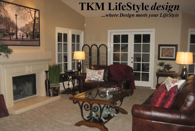
Let’s revisit our discussion about the use of color…I am frequently asked about painting accent walls. I love the idea of making a strong, confident color statement in your home!! Especially, since most of us over use “beige”. I have often told my clients “don’t Beige yourself into Boredom!“ This happens in your home purely by accident, the reason being almost everyone is afraid to make a bold color commitment. The result being…beige on beige with a little more beige as an accent…uh huh.
 So, let’s think outside that beige box! Take a look at the room you would like to add a “Pop” (I hate it when I use cliché terms like this!) of color…frequently, it will be the room in which we spend the most time…such as the living or family room. Ask, what color will enhance your furnishings and accessories? Really pay attention to the “color” you repeat the most often in your room. In my case…that color would be burgundy, it is in my throw pillows, candles and artwork…I think I really love burgundy! My next questions would be…do I love this color enough and do I have the courage to go with such a bold color? In my case, that would be a yes! My theory is, really and truly it is just paint! If, afterwards, it’s discovered it was a huge mistake…don’t panic…paint over it!!! I have actually had to do this recently, my son and I painted his daughter’s room a “soft” green…then we discovered it wasn’t so soft. Oops! So, we repainted it a lovely yellow…problem solved.
 It‘s time to determine which wall or walls to paint. Hmmm…this could be a challenge, because the wall/walls chosen will be the focal point in the room. The decision to paint 1 versus 2 walls in a room depends on a couple of thoughts…is it a dramatic effect desired (1 wall), or is the aspiration to “accent” all the tones in the room? This decision will also depend on the size of the room. For example…my personal preference in a large space, such as a Family Room, is to choose 2 walls that are connected. Especially if the room has high ceilings…it can handle a bold color statement. In a large room…to my eye, if only 1 wall has an accent color its like a postage stamp on a white envelope, it will pop out, but does it look like it belongs there? The goal is for the accent color to look like it belongs with the rest of the room, not just a “pop” of color. However, in a smaller room such as the master bedroom…1 accent wall may be a better decision. Again…it all goes back to what the desired effect is! I‘ll let you in on something, in one of my homes, I painted all 4 of my bedroom walls burgundy...loved it!!
As a side note, I prefer keeping the baseboards and ceilings an off white, this gives a crisp look to the room. Swiss Coffee is my white of choice.
I have much more to share on this subject, but I am going to save it for the next blog. I hope this will inspire you to add some color in your own home. Now to decide on what color that will be?! Check back next week when I continue my mission of helping you create a home...where Design meets your LifeStyle.
Talk soon, Laura
Subscribe to:
Posts (Atom)